top of page
RECOVERY
User onboarding wireframes focused on acquiring a wealth of data while ensuring efficiency, privacy, and motivation by users.
Case Study || 2021

The Problem
The mobile app focused on recovering addicts does not yet have a high-level, UX designed, mobile onboarding process for users. Because the app offers the user an opportunity to aggregate large quantities of data, it is essential to streamline the setup process and data collection in a swift and efficient manner.
The Solution
A “first-look tour” combined with “guided task completion” model was chosen for users, to highlight the value-added for the user while simplifying the collection of data.
My Role
Sole Product Designer
-
Secondary Research
-
Personas
-
Ideation
-
Sketching
-
User Flows
-
Wireframes
-
Prototyping
-
Usability Testing
My Growth
I learned the power of usability testing to unequivocally demonstrate bad usability. I learned the limitations and unique concerns associated with health-focused products. I learned there is still opportunity for creativity within business constraints. I learned that translating skills from Sketch into Figma was suprisingly fast and easy. And I learned the power of collaboration with developers and analysts.
Secondary Research
77% of users stop using an app after just 3 days after having downloaded it.
Excellent onboarding maintains momentum, remind users of the value of the product, rewards progress, and uses a clear progress indicator.

Within the spectrum of health-focused onboarding, providing high-level summary information up front is essential and incentivizing the onboarding process is critical.
Persona Development
Utilizing first-person interviews already done by the company, I was able to separate out two distinct personas: a newly-recovered person and a person who had been in recovery for years.

Longtime Recovered Luisa

Newly Recovered Nick

Longtime Recovered Luisa
1/2
How Might We Questions
How might we invoke feelings of safety about inputting lots of personal data?
How might we motivate and inspire users to regularly use our product?
How might we make the app like a trusted friend?
Ideation
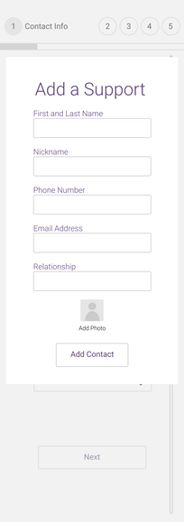
Based on the assumption that users will be adopting the app through their care provider initially, this version of onboarding focused on addressing the value-added for the user. A “first-look tour” was essential to remind the user why adding personal data was essential, with a specific screen dedicated to security concerns. The setup process would utilize “Guided Task Completion” to assist users of all skill levels through the data input process. A success state would be essential after onboarding/setup completion, as well as integrating an easy-to-understand progress indicator to ensure completion.
Sketching
After reviewing user flows already developed by the company and making minor adaptations, I was able to move into sketching.

1st Set of Screens

2nd Set of Screens

4th Set of Screens

1st Set of Screens
1/4
Wireframing
This project was my first one utilizing Figma as the design platform. Making the transition from Sketch to Figma was relatively easy and the features unique to Figma made the design process faster and more enjoyable.
Guerilla Usability Testing
Four people were used for guerilla usability testing. All participants were selected randomly and given the following scenario:
Imagine you are a recovering heroin addict. You are working with a recovery center to maintain care and support through your recovery journey. They have recommended this app as a way to predict and prevent relapses through wearable technology. You have just downloaded the app. Move through the setup process.

Iteration
Opportunities for redesign
-
Complete redesign of survey: reduce cognitive load, shorten expectations, remove open-ended questions, clearer copy.
-
Adjust design of “Add Appointment” feature to include additional possibilities.
-
Optimize copy for consistency.
-
Keep “First Look Tour” and progress tracker.
-
Add modal discussing value-added from location permission.
Final Design
My final design addressed all feedback from critical to minor. Specific attention was given to the redesign of the survey; ensuring user buy-in every day for collection of data is necessary for the app’s effectiveness. Adjustments were made to copy and consistency throughout, minor interaction capabilities were added, and a modal discussion app permissions tailored to user incentive was also added. Lastly, the “Add Appointment” feature was adapted to include more UI possibilities while keeping user control simple and efficient.
Explore my interactive prototype!
Final Conclusions
Because the main deliverables for this project were wireframes and wireflows, future iterations will obviously need to embrace and integrate visual design best-practices, moodboards, color theory, and illustrations. Due to the variety of users who will be using the app, it is imperative that illustrations are used vs. photographs so as not to isolate users by misrepresentation or lack of representation. Possibilities for future iterations also include a feature allowing users to quickly scan prescriptions instead of inputting data individually and further efforts toward gamification.
bottom of page


